Voice input for iOS, Android, and dual-screen devices
Why Voice input?
Voice is not only quickly gaining popularity in the marketplace but also heavily relied upon by different types of users. The goals of this project were to:
- Make our keyboard more accessible for users by offering an important form of input that was previously unavailable on SwiftKey iOS (and heavily requested by users)
- Bring feature parity with our competitors by updating and improving our Android voice typing experience
- Design voice input experience that would work on dual-screen devices
- Remove reliance on a third party experience
- Collect de-identified speech data for Cognitive Services Speech SDK to improve our service and offering for users
- Increase coherence with other products in the Microsoft ecosystem - working towards "One Microsoft" - using, promoting, and enhancing our own products by using Cognitive Services Speech SDK
"iOS needs to open up voice dictation for SwiftKey! Stock keyboard is inefficient and it's super inconvenient to switch back and forth for a feature I use all the time" - User request
Role: Lead Designer
Design research
Journey mapping
Wireframes + user flows
Interaction design
Visual design
Involved in usability testing
Collaborate with other Microsoft voice typing product teams
Platform
iOS
Android
Dual-screen
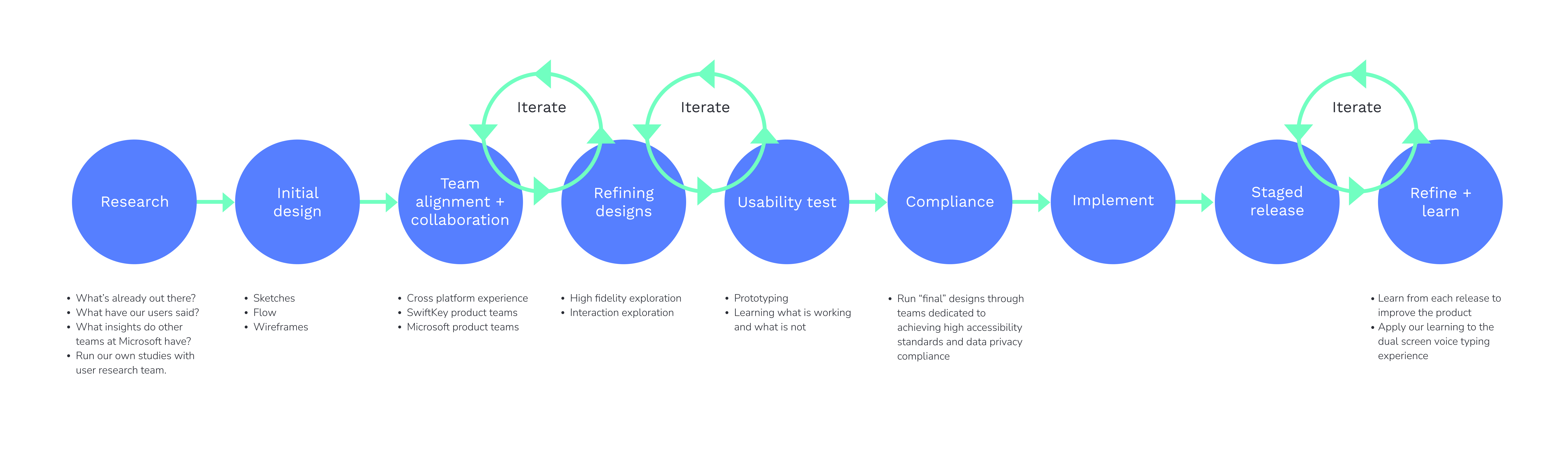
Process
To begin, the team’s focus was on designing and implementing a voice typing experience for iOS, moving on to updating the existing Android experience (from using the Google voice IME to adopting the Android speech component for a more integrated experience). We then optimised this for the new dual-screen device that Microsoft was yet to release (released in Sept 2020). It’s important to note that although this seems like a linear progression, the cross-platform and cross-device design and UX coherence was considered from the very initial stages of the project and throughout.
RESEARCH
I started by running competitor reviews for entry points, input flows, language switching, etc. I looked through existing support tickets related to voice input, customer App store, and Playstore reviews, and enquired into previous research studies and data insights by other teams.
DESIGN
Through my research, it was fairly clear how voice input should work in order to achieve design parity with our existing Android experience. Although the Android experience was road-mapped to be updated shortly after, it was imperative not to overhaul the experience of our 30M monthly active users.
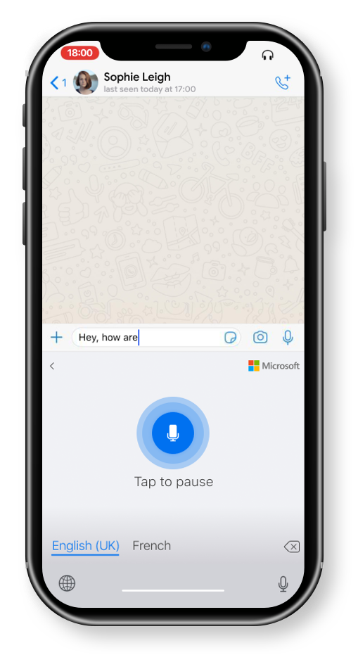
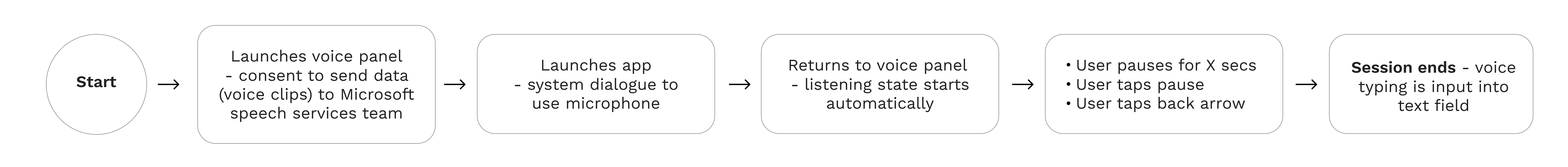
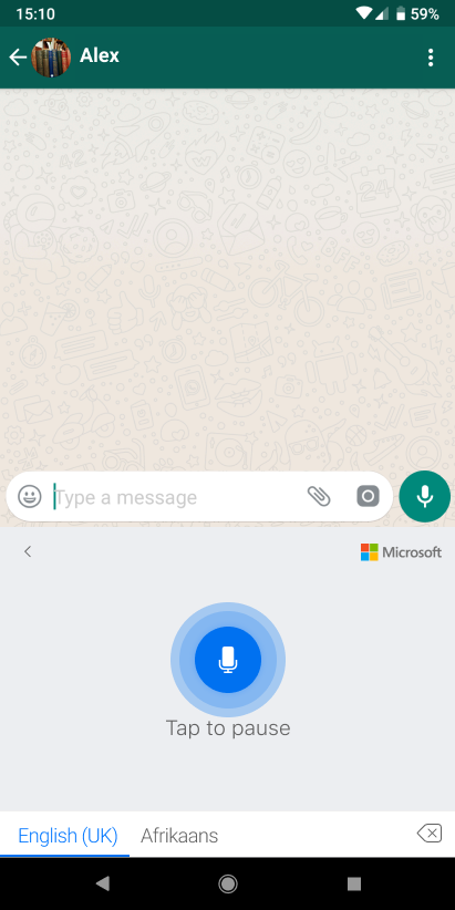
First Run experience flow
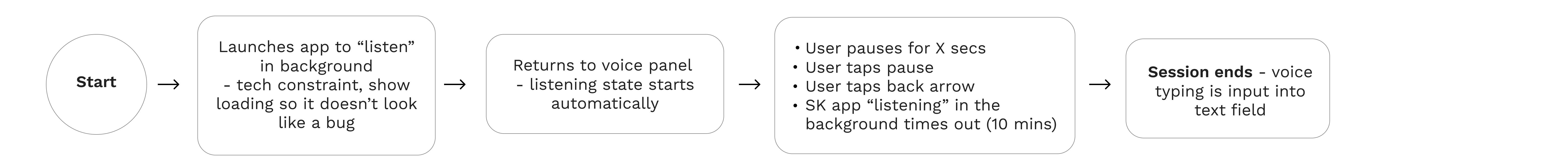
Flow after first run experience
I leveraged existing UX patterns and mechanisms, focusing on refining the micro-interactions and edge cases through testing and iteration and future-proofing the designs for the dual-screen experience.
CHECKING IN
It became clear that many people in the Swiftkey team had strong opinions on possible layout changes. I instigated and led a meeting with the SwiftKey Typing Council in relation to the entry point for voice input, ensuring that I practiced diversity and inclusion in my decision-making by giving people a platform to be heard.
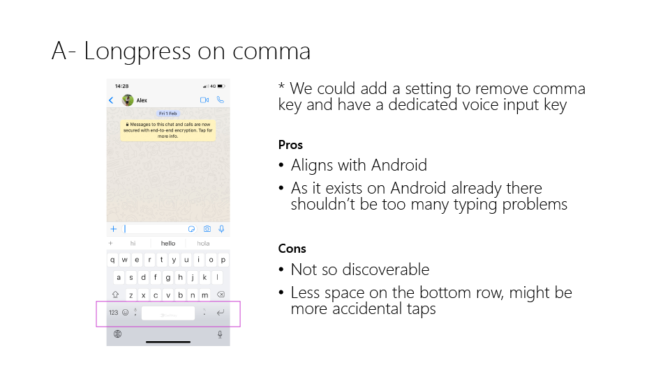
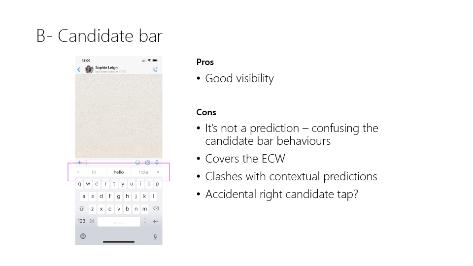
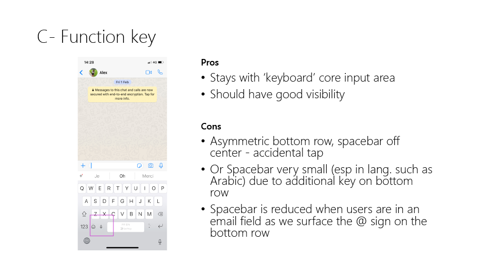
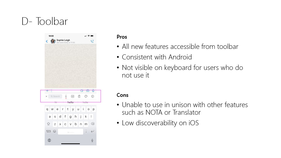
I prepared a slide deck on the areas of contention. In this example, the voice input entry point. This was meant to look rough – as a work in progress - and to be used as a talking point for all to contribute. (This is just a sample the deck also highlighted relevant keyboard settings data, mock-ups and competitor benchmarking)
VISUAL EXPLORATION
I explored many different visual treatments for the UI and icons.
CROSS TEAM COLLABORATION
I had several meetings throughout my design process to collaborate with designers on other product teams within Microsoft who were working on voice input. We strived to align on designs and principles as much as possible and appropriate for the platform.
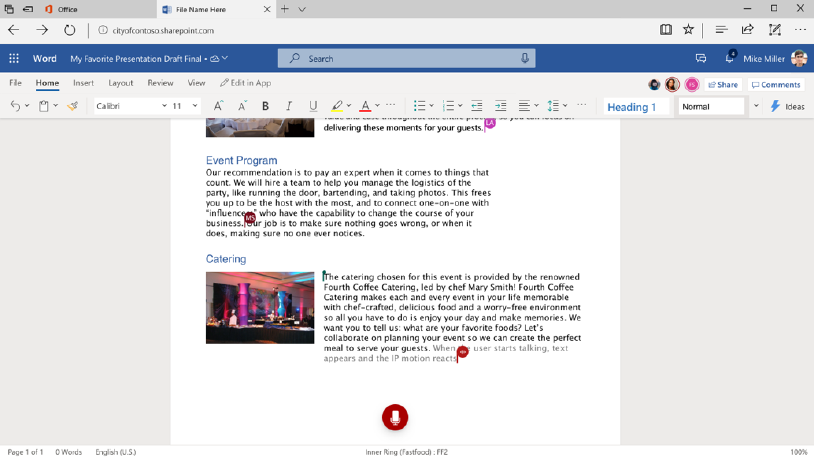
Looking to align the UI and - as much as possible - the UX across Office, Windows, and SwiftKey voice input.
For consistency across Microsoft products, we adopted or aligned certain icons and visual treatments. Testing was necessary to validate their usability in this context, on this device, on this platform. We worked to find alignment on interaction animations.
USABILITY TESTING
I find that usability testing is usually the most insightful part of the design process. If there are any red flags, you can often get clear, tangible next steps for the design iteration just by observing what the user does.
I like to work closely with the user researcher to devise a script and tailor the prototype to best test and gain insight into the feature.
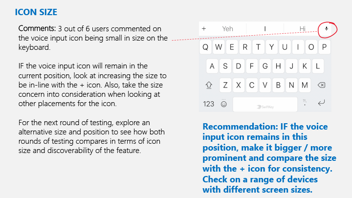
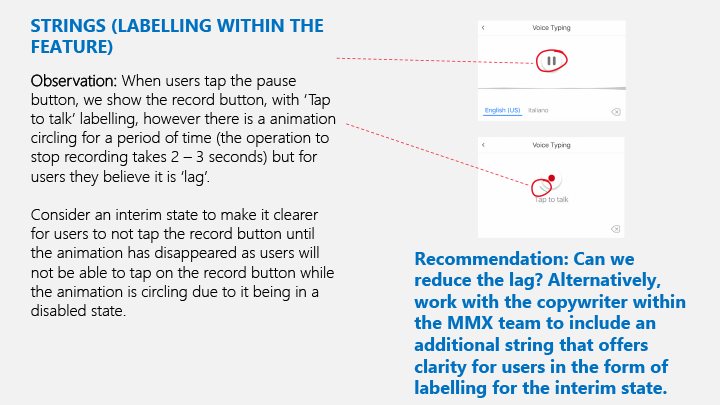
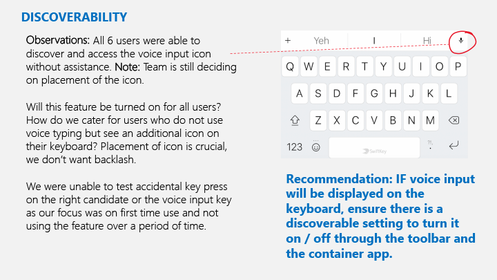
Here are a few examples taken from a report the researcher put together with tangible action points to consider incorporating or changing in my designs.
I stipulated the importance of recruiting various different profiles, working in line with Microsoft’s drive for diversity and inclusion, and bettering our products by testing in different locales, with a range of languages and in different accents.
There were a few key findings (as well as some more minor ones). The results showed that the language models behind our target MVP languages were not up to scratch - this informed our target MVP release to be scoped down to cover English only until the language coverage could be broadened and quality improved by the partner team who provided the voice to text API.
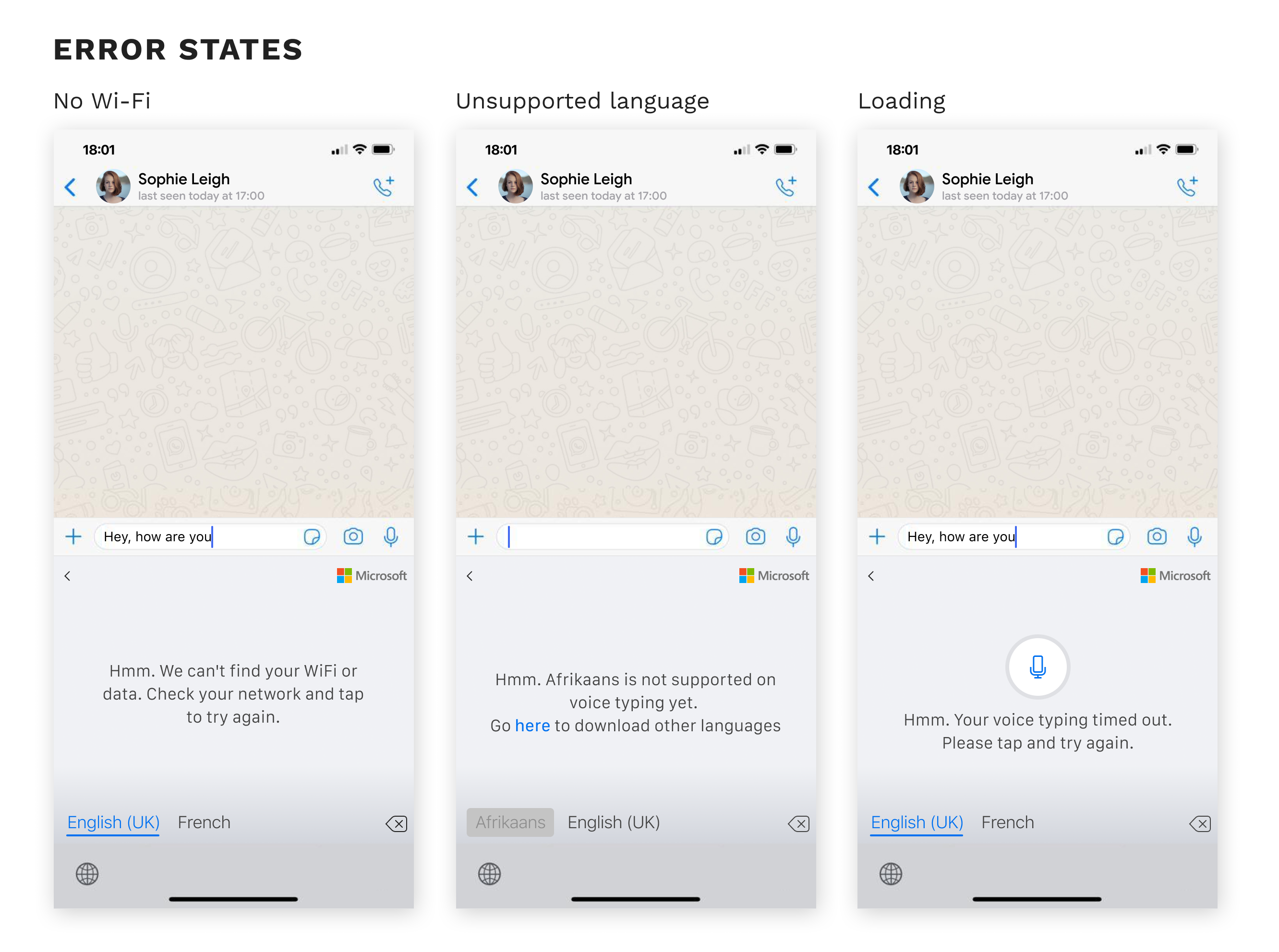
Usability testing also helped to inform our error states. A few examples are shown below.
FINAL DESIGN + IMPLEMENTATION
Although I consider accessibility and data privacy compliance throughout my design process, I ran my “final design” mocks through the relevant dedicated teams at Microsoft who specialise in these fields, to advise for any improvement tweaks.
As with all projects, I put together red lines in the Figma file and worked closely with the respective developers, for both the iOS and Android products, throughout implementation. Iterating as many times as required to make sure that the build looked like the final design.
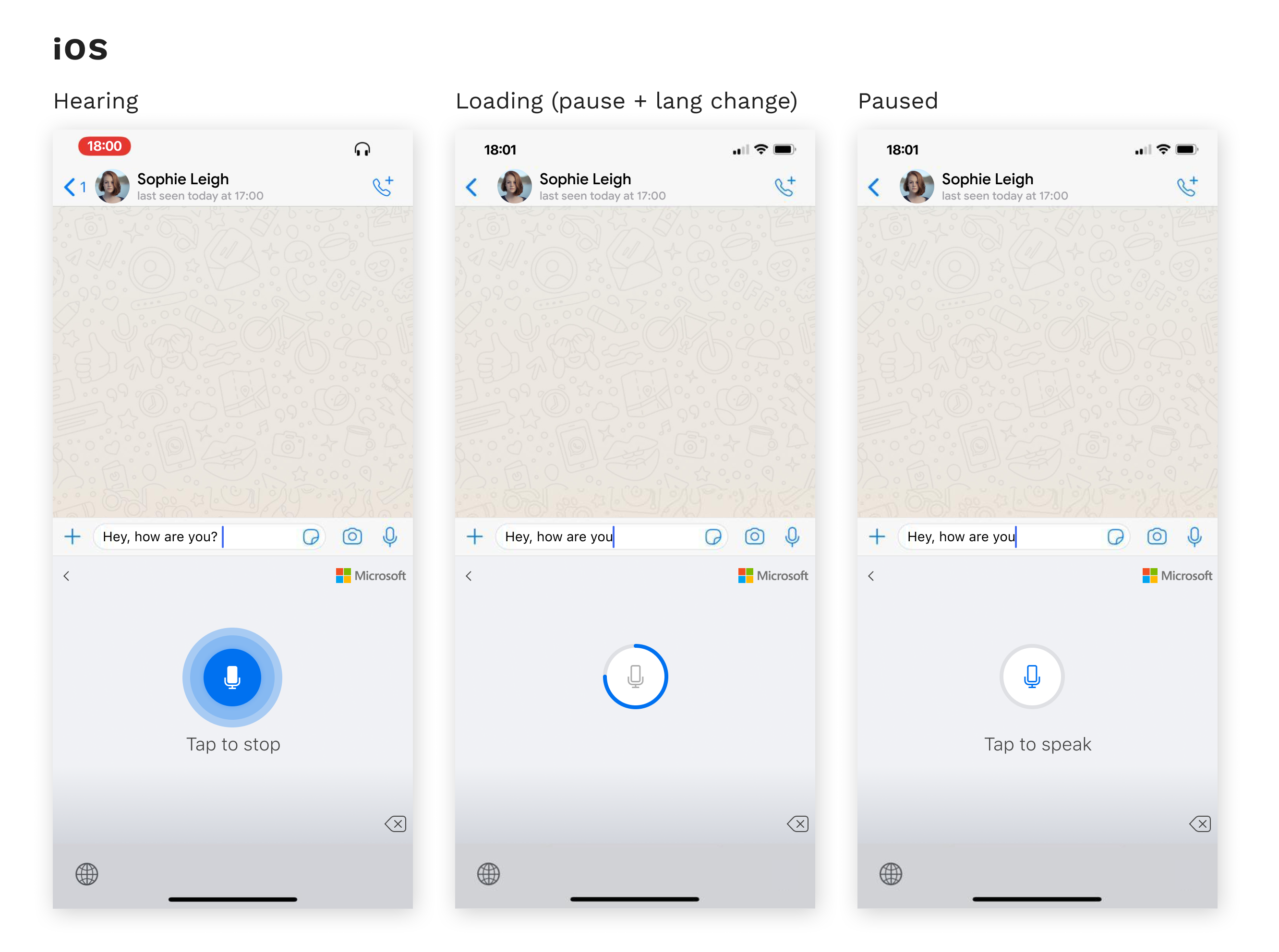
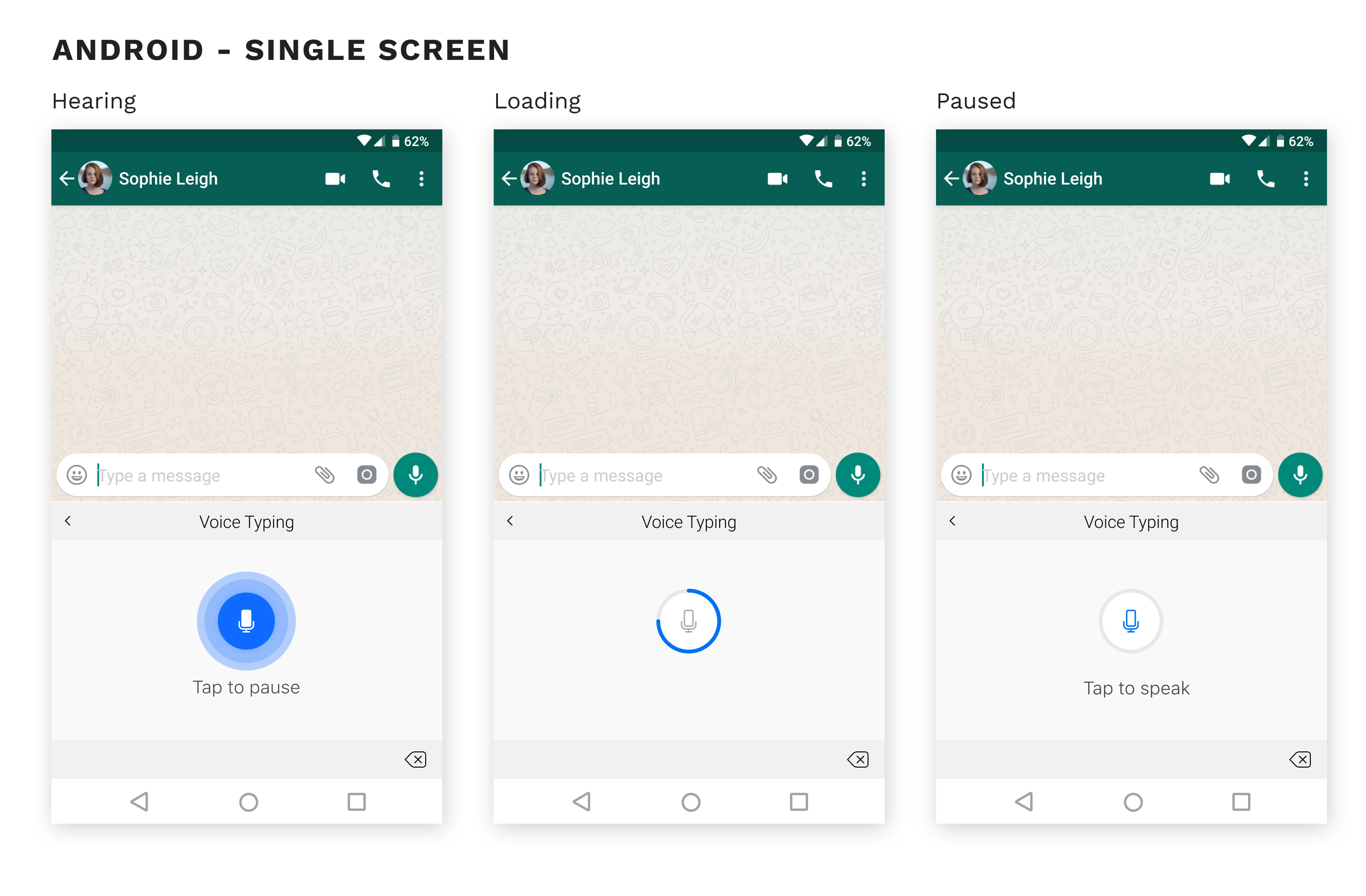
Below shows the different voice states in the iOS and Android experience.
Below shows the complexities of designing for the dual-screen experience, with all the variations in postures and keyboard modes.
PROJECT OUTCOME
iOS released Jan 2020
Android dual-screen experience released Sept 2020
- 30M+ MAU on Android
- 100k+ MAU on iOS
Feature parity on SwiftKey Android and iOS
- Successfully designed an experience that works across all different combinations of the 5 keyboard postures and 4 different keyboard modes of the dual-screen device
Coherence with other Microsoft speech services
User Feedback
"Remarkable dictation! This app’s dictation is STUNNING! It even puts in punctuation without having to say it out loud! Thank you also for letting it run long enough to dictate paragraphs, instead of a sentence at a time."
Contact
Phone: +44 747 833 7576
Email: hi@kahmunliew.com
KML Design Ltd
71 - 75 Shelton Street
Covent Garden
London
WC2H 9JQ
Copyright © 2022 Kah-Mun Liew | UX and Product Designer